
CSS Handles and the power of customizing blocks
CSS Handles and the power of customizing blocks
Introduction
Taking a quick look at your online store, you'll notice that components have similar styles, even without applying any customization.
All of them share pre-established values for font, background color, main color, button format, etc. For instance, the Info Card.
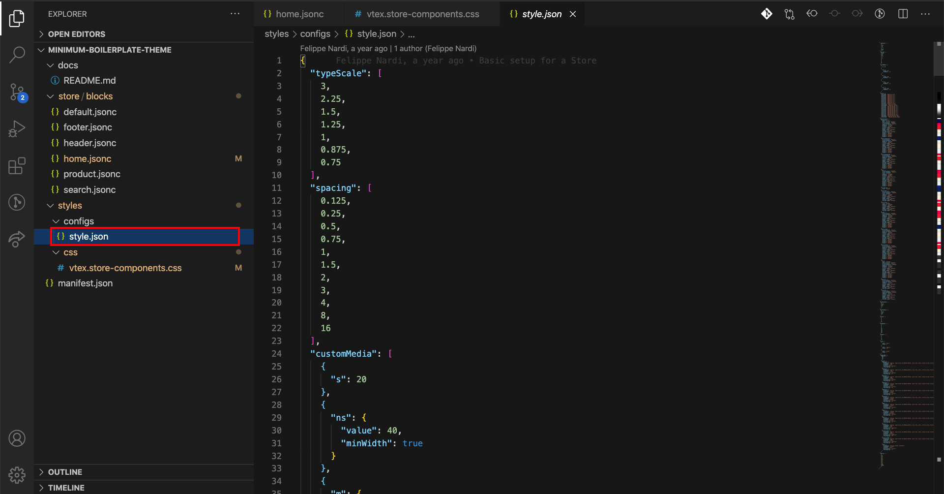
This is due to the style.json, the file responsible for declaring generic customization values for every Store Framework store.
To create a unique identity for your store's components, you can overwrite these values using CSS customizations.
Analyzing the recipe employed to customize stores using CSS, we can notice that several steps will be needed in order to apply your own style, such as:
-
Create a new file in the
CSSfolder, naming itvtex.{AppName}.css. -
Use the CSS Handle of the component that will be customized in this file in the following format:
.{CSSHandle} { {CSSProperty}: {DesiredValue}; {CSSProperty}: {DesiredValue}; } -
Lacking CSS Handles, apply permitted CSS Selectors, such as
:global(vtex-{componentName}). -
To apply CSS to a specific block and not to every block of that type, use the blockClass resource, which appears next to the CSS Handles when inspecting your code. The blockClass must be declared as a prop in the block in question, and thus be referenced in the style file as shown below:
.{CSSHandle}--{blockClass} {
    {CSSProperty}: {DesiredValue};
    {CSSProperty}: {DesiredValue};
}
Adding Info Card to the Minimum Boilerplate
Before actually customizing an info card, it's necessary to add one, since our theme is really simple. With that in mind, go to home.jsonc file and add two info cards to its blocks:
{
  "store.home": {
    "blocks": [
      "rich-text",
+     "info-card#clearance",
+     "info-card#vintage"
    ]
  },
  "rich-text": {
    "props": {
      "text": "VTEX Store Framework",
      "textAlignment": "CENTER",
      "textPosition": "CENTER",
      "font": "t-heading-1"
    }
  }
}
Now, let's define those blocks in the same file, right below the rich-text definition. You can use the following code block to insert on the file:
"info-card#clearance": {
"props": {
"id": "info-card-clearance",
"isFullModeStyle": false,
"textPosition": "left",
"imageUrl": "https://storecomponents.vteximg.com.br/arquivos/banner-infocard2.png",
"headline": "Clearance Sale",
"callToActionText": "DISCOVER",
"callToActionUrl": "/sale/d",
"textAlignment": "center"
}
},
"info-card#vintage": {
"props": {
"id": "info-card-vintage",
"isFullModeStyle": false,
"textPosition": "right",
"imageUrl": "https://appliancetheme.vteximg.com.br/arquivos/cozinha-rosa-min.png",
"headline": "Vintage",
"callToActionText": "DISCOVER",
"callToActionUrl": "/sale/d",
"textAlignment": "center",
"blockClass": "vintage"
}
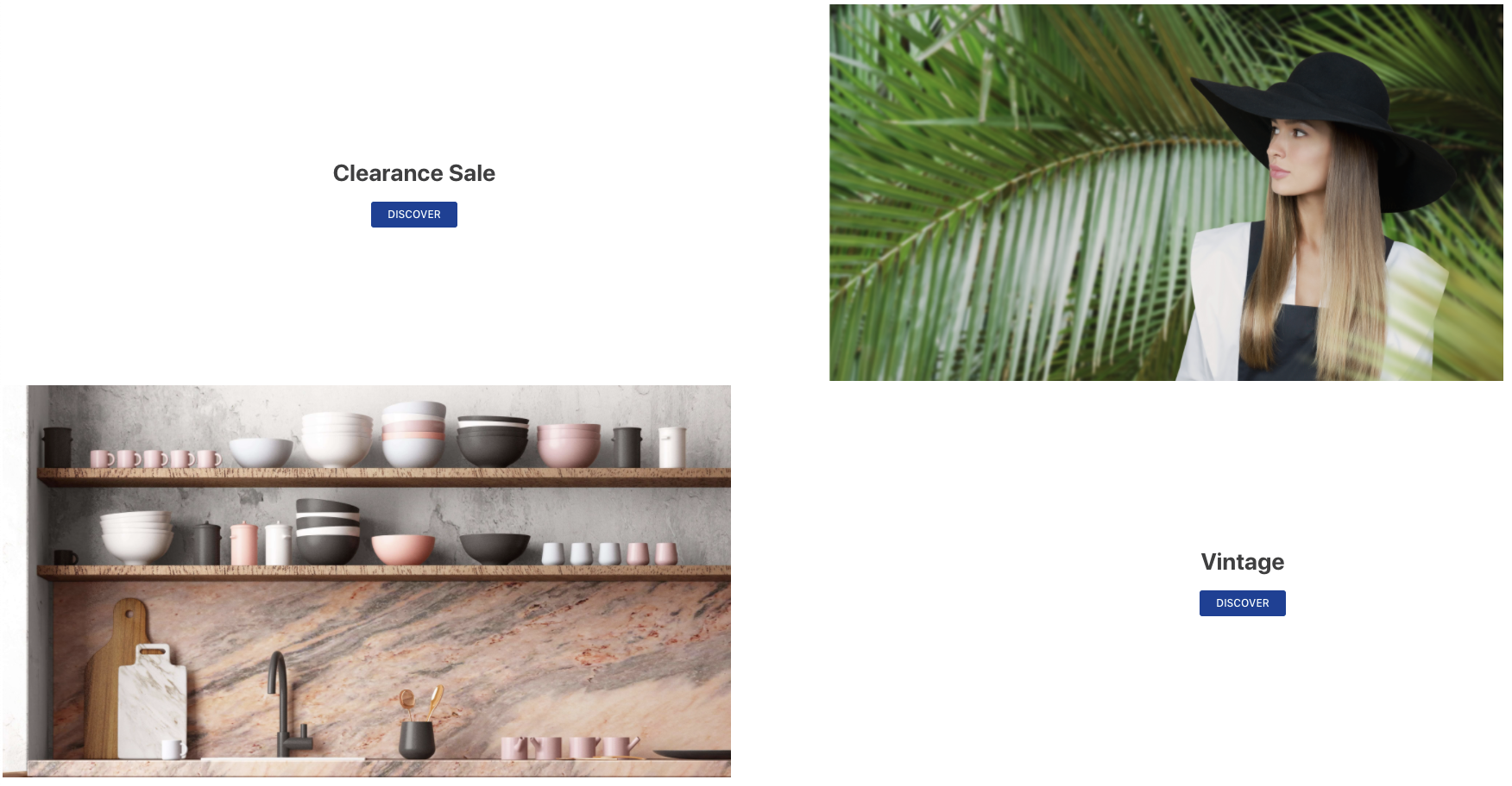
}By doing that, you're expected to see the home page similar to the following image:
Customizing the Info Card you've just added
To uncover a component's CSS Handles, such as the Info Card, simply access your documentation's Customization section.
According to the description of CSS Handles and to the store customization recipe using CSS, we can implement a customized Info Card example.
-
On the
vtex.store-components.cssfile, found in/styles/css, let's edit its title and call-to-action button configurations by adding the following code:/* /styles/css/vtex.store-components.css */ .infoCardHeadline { font-family: serif; font-size: 2.25rem; font-weight: normal; color: gray; border: 2px solid black; padding: 24px; } .infoCardCallActionContainer :global(.vtex-button) { color: white; background-color: gray; border: transparent; } .infoCardCallActionContainer :global(.vtex-button):hover { color: gray; background-color: blue; border: transparent; }You can check the effect of these changes by running the
vtex linkcommand.
-
Next, we'll add a specific style to the vintage info card. In order to do that, we first need to add
blockClass, as shown below:"info-card#vintage": { "props": { "id": "info-card-vintage", "isFullModeStyle": false, "textPosition": "right", "imageUrl": "https://appliancetheme.vteximg.com.br/arquivos/cozinha-rosa-min.png", "headline": "Vintage", "callToActionText": "DISCOVER", "callToActionUrl": "/sale/d", "textAlignment": "center", + "blockClass": "vintage" } } -
Thereafter, declare a
background-colorfor this specific info card in your CSS file:/* /styles/css/vtex.store-components.css */ .infoCardContainer--vintage { background-color: #edcfd1; }The result should be similar to the image below:

-
Now let's finish by adding some more style to our Info Card. On the same CSS file that was used before, define a maximum width (
max-width) of1260pxfor all info cards, a margin of0 autoand a padding of0.You can do it based on the Info Card Handles.
/* /styles/css/vtex.store-components.css */
.infoCardContainer {
  max-width: 1260px;
  margin: 0 auto;
  padding: 0;
}
By doing that, the expected result is:

-
Change the component's title color to
blackand the font weight tobold:.infoCardHeadline { font-family: serif; font-size: 2.25rem; - font-weight: normal; - color: gray; + font-weight: bold; + color: black; border: 2px solid black; padding: 24px; }After doing that, you should have:

-
Change the call-to-action buttons background color during hover to
white:.infoCardCallActionContainer :global(.vtex-button):hover { color: gray; - background-color: blue; + background-color: white; border: transparent; }
Make sure that you test also the hovering action in order to validate if the color is correct for this action!
Any questions?
See the answersheet for this step or check our [office hours] on the VTEX Developers channel(https://www.youtube.com/c/VTEXDevelopers)
Help us make this content better!
VTEX IO courses are open source. If you see something wrong, you can open a pull request!
Make a contribution