
Flex layout
Flex Layout: create layouts using the power of Flexbox
Introduction
Flex Layout is a layout structuring paradigm created in the Store Framework to allow the construction of complex layouts. This paradigm uses the concept of rows and columns to define the desired structure and positioning of the blocks on a given page.
There are two basic building blocks of each Flex Layout:
flex-layout.rowflex-layout.col
If you are already familiar with Flexbox used in CSS, Flex Layout should be simple to understand, since Flexbox is being used "behind the scenes" by flex-layout.row and flex-layout.col.
Flex Layout
With Flex Layout, it is possible to create custom layouts, using the Flexbox line and column structure.
Looking at the block's documentation, we see that you can use an array of blocks like Flex Layout's children. In addition, you should always use flex-layout.row andflex-layout.col, NEVER flex-layout in isolation.
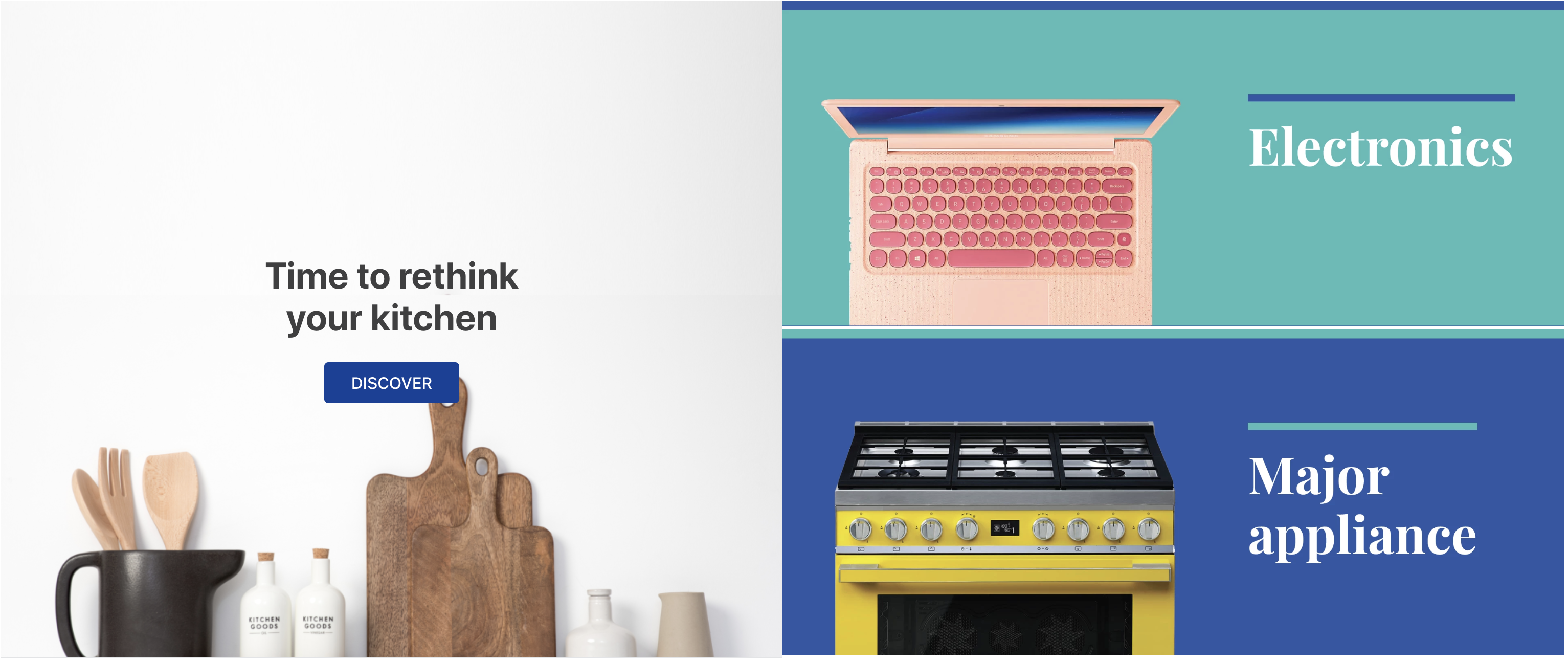
Below is an example of a flex layout composed of a flex-layout.row with two children: an info-card and a rich-text:
  "flex-layout.row":{
    "children": [
      "info-card#rethink",
      "rich-text#deletar"
    ]
  },

 "info-card#rethink": {
    "props": {
      "imageUrl": "https://appliancetheme.vteximg.com.br/arquivos/utensilios-cozinha-min.png",
      "isFullModeStyle": true,
      "headline": "Time to rethink your kitchen",
      "callToActionText": "Discover",
      "textPosition": "center"
    }
  },

  "rich-text#deletar": {
    "props": {
      "text": "I'll be deleted soon"
    }
  }
Activity
-
Declare
flex-layout.rowwithin theblocksof thestore.hometemplate and declare the blocks proposed above in yourhome.jsoncfile -
Change the children of
flex-layout.row, replacing therich-textblock with aflex-layout.colcolumn. -
Delete the rich-text block proposed above from your theme.
-
Declare the
flex-layout.colblock in yourhome.jsoncfile with two image components like children:image#electronicsandimage#major-appliance, in that order. -
Define the
imageblocks with the following props:... "image#electronics": { "props": { "src": "https://appliancetheme.vteximg.com.br/assets/vtex.file-manager-graphql/images/electronics_banner___25d69b49f8224b369375e68513b4d593.png", "maxWidth": "100%" } }, "image#major-appliance": { "props": { "src": "https://appliancetheme.vteximg.com.br/assets/vtex.file-manager-graphql/images/major_appliance_banner___bb10093866a127345ddfbcca3efa5022.png", "maxWidth": "100%" } }
The result should look like this:
Note: Remember to access the Flex Layout documentation if you have any questions during the activity.
Any questions?
See the answersheet for this step or check our [office hours] on the VTEX Developers channel(https://www.youtube.com/c/VTEXDevelopers)
Help us make this content better!
VTEX IO courses are open source. If you see something wrong, you can open a pull request!
Make a contributionUpdated about 1 year ago