
Making Responsive Content
Making your content responsive
Introduction
The homepage of e-commerce is always the customer's first contact with the brand. For this reason, it is common for the shopkeeper to want to establish direct communication with his users at this strategic moment of navigation.
In the Store Framework, there are some components that address this scenario, such as Info Card and Rich Text.
Configuring Rich Text
As well as its functionality, the configuration of Rich Text is also simple, we can put together an example of implementing the block using text written in markdown. For example:
"rich-text": {
"props": {
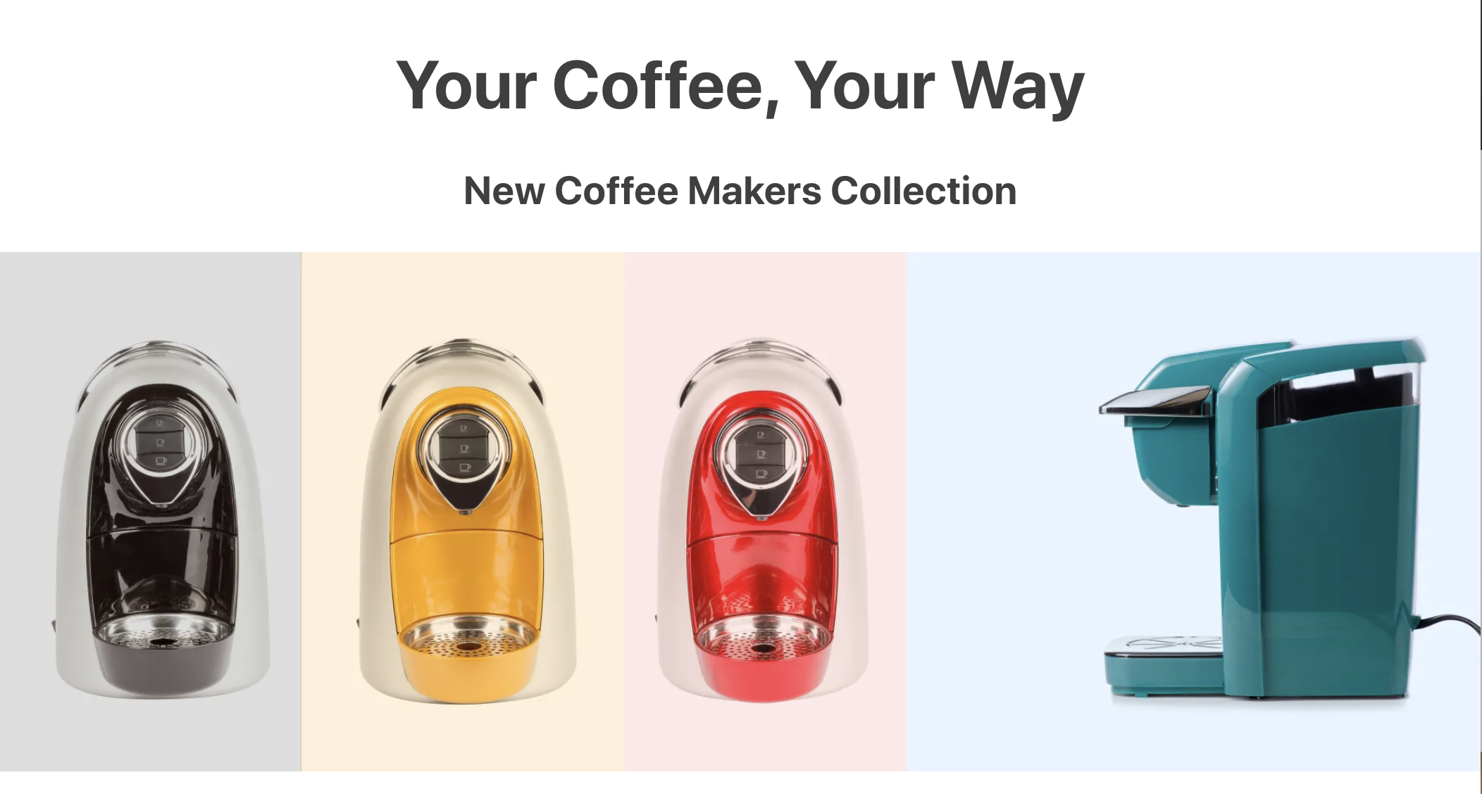
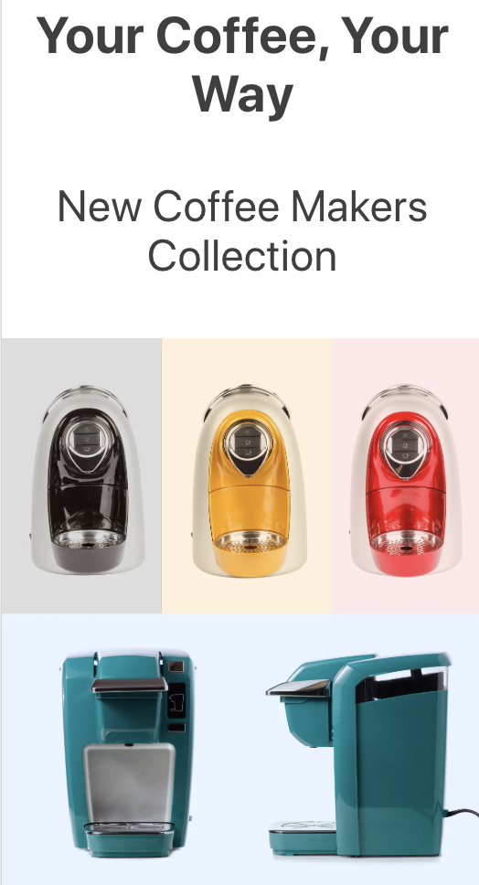
"text": "# Your Coffee, Your Way \n ### New Coffee Makers Collection",
"textPosition": "CENTER",
"textAlignment": "CENTER"
}
},As mentioned earlier, the use of Markdown allows flexibility to the component. But, on the other hand, it can also cause your rendering to change according to the device used by the user.
For example, the phrase above (#Your Coffee, Your Way\n###New Coffee Makers Collection) can use a markdown suitable for desktop, but not necessarily for mobile (whose screen size is smaller).
To solve this scenario and make the component more adaptable to other devices, we must use the Responsive Layout.
First, we must declare the blocks within the store.home template:
"responsive-layout.desktop#desktop", "responsive-layout.mobile#mobile"
Then we must declare these blocks as follows:
...

"responsive-layout.desktop#desktop": {
  "children": ["rich-text#desktop"]
},

"responsive-layout.mobile#mobile": {
  "children": ["rich-text#mobile"]
},

"rich-text#desktop": {
  "props": {
    "text": "# Your Coffee, Your Way \n ### New Coffee Makers Collection (I'm on desktop)",
    "textPosition": "CENTER",
    "textAlignment": "CENTER"
  }
},

"rich-text#mobile": {
  "props": {
    "text": "# Your Coffee, Your Way \n ### New Coffee Makers Collection (I'm on mobile)",
    "textPosition": "CENTER",
    "textAlignment": "CENTER"
  }
}
When interpreting the code above, notice how two Rich Text configurations are built using responsive-layout.desktop#desktop and responsive-layout.mobile#mobile.
Activity
In this activity, let's play around with the Rich Text markdown and learn how to use it with the Image component. All of this using Responsive Layout, of course!
Desktop:
Mobile:
-
Add the code proposed above in the
home.jsoncfile and declare theresponsive-layoutblocks in thestore.hometemplate; -
In
rich-text#mobile, change the markdown of the first sentence toh3and the second toh4;If you don't remember the Markdown syntax, you can consult it at Markdown Documentation.
-
Add
image#desktopas children ofresponsive-layout.desktop#desktop. Do the same withimage#mobileinresponsive-layout.mobile#mobile; -
Declare the following Image blocks:
"image#desktop": { "props": { "src": "https://appliancetheme.vteximg.com.br/arquivos/Responsive-Image-Desktop.jpg?q=1", "link": { "url": "/small-appliances/coffee-makers" }, "alt": "Coffee Makers Collection" } }, "image#mobile": { "props": { "src": "https://appliancetheme.vteximg.com.br/arquivos/Responsive-Image-Mobile.jpg?q=1", "link": { "url": "/small-appliances/coffee-makers" }, "alt": "Coffee Makers Collection" } } -
Analyzing the Image component props, set the maximum width of the two images to
100%.
Note: Remember to access the Responsive Layout documentation if you have any questions during the activity.
Any questions?
See the answersheet for this step or check our [office hours] on the VTEX Developers channel(https://www.youtube.com/c/VTEXDevelopers)
Help us make this content better!
VTEX IO courses are open source. If you see something wrong, you can open a pull request!
Make a contributionUpdated about 1 year ago