
Info Card: Store Framework's call to action
Info Card: Store Framework's call to action
Introduction
A store needs a good home page to engage users, increasing session time and therefore conversion chances. To achieve this, several elements need to be used, such as promotional banners, shelves with highlights, material about the store, etc.
We have created the next block on the home page using a call to action. In Store Framework, we have a block designed for this purpose, called Info Card.
Starting out with Info Card
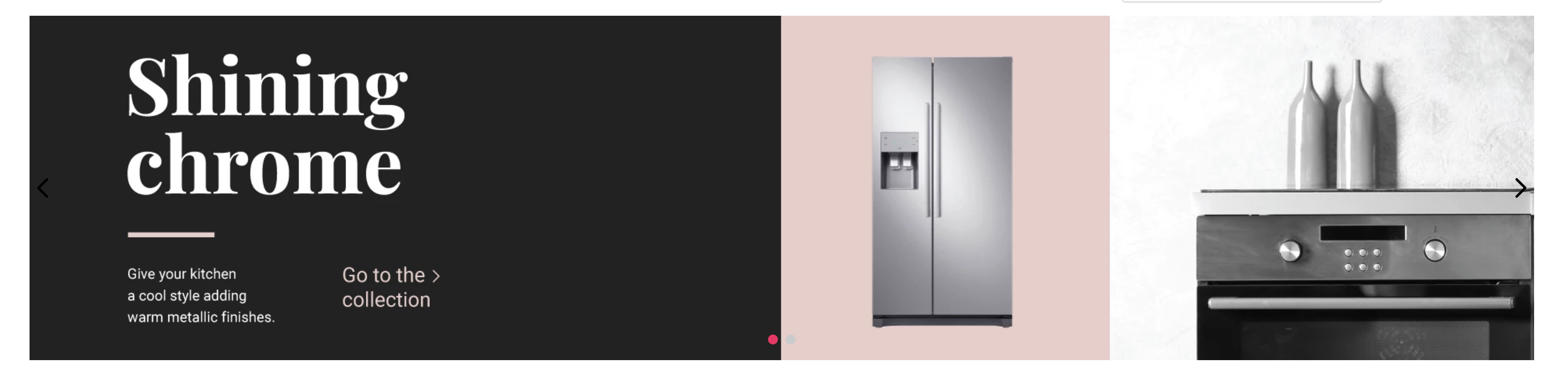
Using the Info Card, you can create images which have links and buttons (top or side of the block) that direct the user's flow (Call to action).
Looking at the documentation, we can see that:
isFullModeStyledefines whether the Call to Action (CTA) is set above the banner;textPositiondefines the position of the text;textAlignmentdefines the text's alignment;imageUrldefines which image will be used as banner;headlinedetermines which text will be used as headline;callToActionModeallows to choose the CTA mode as either a link or a button;callToActionTextdefines the CTA text;callToActionUrldetermines the URL to which it redirects;
We therefore have the following props:
{
  "store.home": {
    "blocks": ["rich-text", "info-card"]
  },
  "rich-text": {
    "props": {
      "text": "*Hello, World!*",
      "textPosition": "RIGHT"
    }
  },
  "info-card": {
    "props": {
      "isFullModeStyle": false,
      "textPosition": "right",
      "imageUrl": "https://appliancetheme.vteximg.com.br/arquivos/cozinha-rosa-min.png",
      "headline": "Vintage Pink",
      "subhead": "Give your kitchen a boho style adding vintage apparels.<br>Available until January 2020.",
      "callToActionMode": "button",
      "callToActionText": "Explore",
      "callToActionUrl": "/sale/d",
      "textAlignment": "center"
    }
  }
}
Instancing blocks
You may have asked yourself:
"What if I wanted to have two different Info Cards?"
It's possible through block instancing.
All block have pre-established names, but you can create block instances and define different ways in which the block types appear. After each block has been defined, simply place an '#' with an arbitrary name that makes, for example:
  {
    "store.home": {
      "blocks": [
        "rich-text",
        "info-card#button-right"
      ]
    },
    ...
    "info-card#button-right": {
      "props": {
        "isFullModeStyle": false,
        "textPosition": "right",
        "imageUrl": "https://appliancetheme.vteximg.com.br/arquivos/cozinha-rosa-min.png",
        "headline": "Vintage Pink",
        "subhead": "Give your kitchen a boho style adding vintage apparels.<br>Available until January 2020.",
        "callToActionMode": "button",
        "callToActionText": "Explore",
        "callToActionUrl": "/sale/d",
        "textAlignment": "center"
      }
    }
  }
Activity
-
In the
home.jsoncfile, based on the code above, create theinfo-card#button-leftright under the info card:info-card#button-right. This new info card must implement the following props:- The title must be
Shining chrome - A link type call-to-action with the following text instead of a button:
Go to Collection - The following image
https://appliancetheme.vteximg.com.br/arquivos/cozinha-cinza-min.png - The following subtitle
Give your kitchen a cool style adding warm metallic finishes.<br>Available until January 2020. - Text to the left of the image (
textPosition).
... "info-card#button-left": { "props": { "isFullModeStyle": false, "textPosition": "left", "imageUrl": "https://appliancetheme.vteximg.com.br/arquivos/cozinha-cinza-min.png", "headline": "Shining chrome", "subhead": "Give your kitchen a cool style adding warm metallic finishes.<br>Available until January 2020.", "callToActionMode": "link", "callToActionText": "Go to collection", "textAlignment": "center" } } ... - The title must be
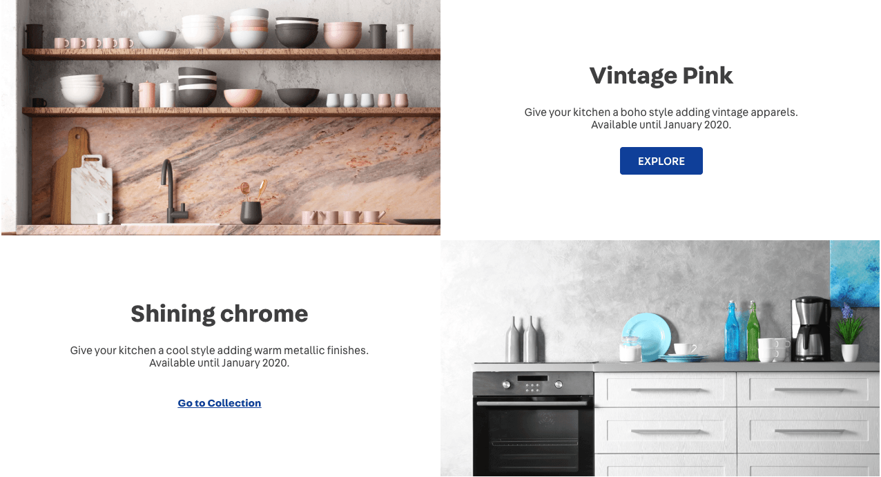
The expected result will look similar to this:
Note: Remember to access the Info Card documentation if you have any questions regarding the activity.
Any questions?
See the answersheet for this step or check our office hours on the VTEX Developers channel.
Help us make this content better!
VTEX IO courses are open source. If you see something wrong, you can open a pull request!
Make a contributionUpdated about 1 year ago